
Project Scope
Research + design a college app with information easily accessible
Duration
3 months (July 2023 - October 2023)
Role
UX/UI Designer
Tools
Figma
OverviewCollege Bound is an application used to read and compare important information about colleges.
the ProblemStudents are overwhelmed selecting a college & major. 🫠
As a former college student, I remember how stressful it was deciding where to go and what to study. My peers and I barely had any help or 1-on-1 time with a high school advisor to plan the next four years of our lives. When I learned that most students today lean on social media for information about a college from the Statista Research Department, it gave me the idea to design an application I would have liked to use.
The SolutionEasy to read, and accessible information + compare tool. 🔧

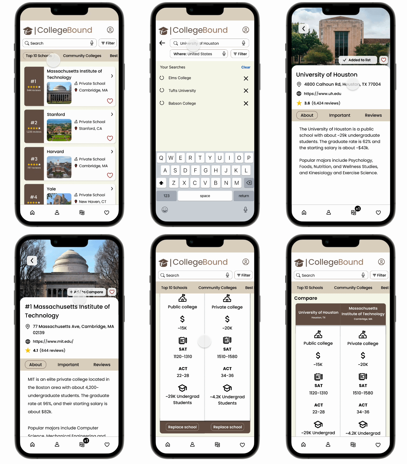
To best organize information, I made four main categories at the top on the home page. This allows for room to explore colleges in a category you are interested in. There is also a search option if you are looking for a specific school.
If you are stuck between two schools, there is also a compare option for you to see the stats for both side by side.
ResearchWhy, what and how. 🧐
Research Plan
Creating a research plan allows me to study my competitors and users; I’m able to dig deep into their reasonings around their interaction with a prototype like mine.
I have listed research questions, methodologies, participants, recruiting methods and schedule in my Capstone #1 Research Plan
Research Goals
Identify people’s process of researching and choosing a college
Understand the negative and positive experiences along the way
Learn about competitors and their strengths and weaknesses
Methodologies
User (semi-structured) interviews (5) and survey to assess demographics, understand pain points and behavior toward choosing a college and what to study.
Usability testing (10) to observe any issues and allow for feedback.
secondary researchCompetitive Analysis
Niche (3.7/5.0 Stars) on App Store (based on reviews)
General Research
To explore more information on the subject, I looked into statistics regarding college graduates and come to find out:
“About 80% of students in college end up changing their major at least once”
primary researchScreener Survey
I sent out a five question survey to the Springboard Slack group chat and my friends to understand people’s experiences about when they decided to look into going to college. I got 18 responses and these were the key results:
Although most people had their mind made up about what to study, they changed their major a lot (maybe changed to something in the same field/school?)
Most people rated their experience a 3/5 or more due to them already having an idea of where to go
User Interview
I created interview questions to ask during the five interviews I conducted with my friends via Facetime. These are the user interviews notes that include each person’s comments, responses and concerns.
Significant Responses:
100% of the participants said:
They assumed they’d go to a school nearby since they were most familiar with that
The biggest factors when deciding were:
Cost
Distance
Research SynthesisAffinity Map
Grouping qualitative information into categories
Empathy Map
To organize a user’s thoughts and behaviors
User Personas
Fictional characters that are likely to be common users, based on conducted research
How Might We I came up with these questions and solutions for each to help focus on the right problems
How might we make the process of applying to schools easier?
How might we help those who are interested in going to college but don’t know where to or what to study?
How might we support users to efficiently search for options based on their certain limitations (cost, distance, ect)?
User Stories
These are statements from the user’s perspective that are to help with the expectations of the application
As a junior in highschool, I want to look into potential schools now and apply asap, so that I have options and a headstart on starting college.
As a parent of an incoming college student, I want to research (ranked well) nearby schools and schedule tours to take together, so we are comfortable with whatever decision we make.
Site Map
After conducting research, brainstorming ideas and deciding what to include, I created this site map to help me organize pages and link them together when designing the application.
User Flow
These are a couple paths a user is likely to take
designSketches
I did quick 10 minute usability tests with five friends where I asked them to test my prototype of sketches. This just included main buttons to be able to go through the screens.

Main Concern:
There were issues with buttons not linked, and as a result, sometimes there was no way to go back so they would have to restart the prototype.

Going forward:
I will add missing buttons and link it to the corresponding page
Have a way to go back to the home page on each page
Low Fidelity Wireframes
Once the sketch prototype was fixed and a success, I designed low fidelity wireframes for better structure. While converting these designs I left a lot of room for details to add, remove or change anything later.

Edge Case
I identified an edge case, a rare situation, while creating the login/signup pages. Although it is unlikely for a user to not have an email address, I made that input optional so in that case they are able to sign up with a username instead.
Wireflow
I created a wireflow with the low fidelity screens to show the interactions a user would .
High Fidelity Wireframes
After changing the style guide to fit the school-like aesthetic more, and testing multiple times, there are four total versions of the high fidelity screens, each having notes on what to add or change.
(Link to all the High Fidelity Screens)
TestI performed five moderated remote usability tests and the following were participant characteristics:

Have gone to college or are in college currently

Ages: 22-24
First I created a Test Script and College Bound: Usability Test Plan to stay consistent with each test, so that I am asking the same questions to each participant. There were a total of nine flows I had prepared consisting of tasks like: observing each page in the navigation bar, using the compare tool and favoriting a school. I took User Testing Notes during each test so I could put the Usability Test finding in a list ordered by priority with the problem and solution next to it.
Taking these concerns, I reiterated my designs to fit the user’s needs.
The major improvements include:


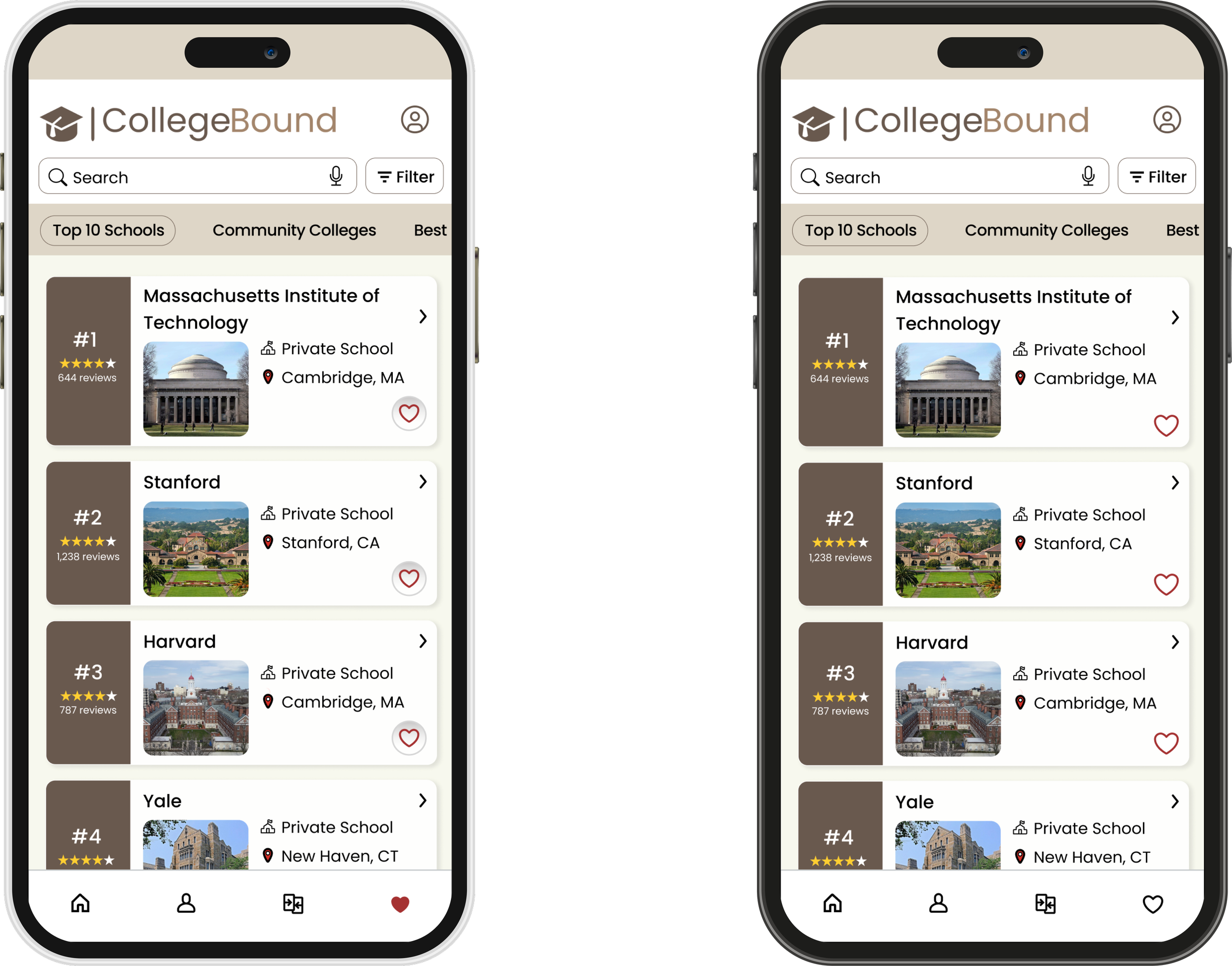
The heart in the navigation bar is not full unless clicked on and it is black now to provide contrast from the red hearts on the favorites page
Removed circle around heart on the list


I added the input to confirm password for any potential mistakes

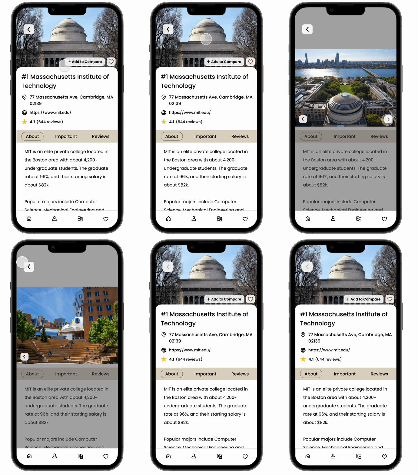
I added more pictures for when you click a school
Also, I aligned everything that needed to be and made the buttons a bit bigger for an easier tap.
conclusion + going forwardGood things take time
This is my first UX/UI project and although it took me three months, I gained so many valuable lessons. It was A LOT of new information to learn and showcase. During the span of these few months, I rewrote, redesigned, and reiterated many many times. Lucky for me, I have a patient mentor and friends and family that gave me productive feedback.
In my next adventure:
Organize my thoughts and blueprints better to have a more confident direction so that I do not have to remake most of my designs.
Focus more on the solution points and not on trying to include EVERY little thing that MIGHT even be related to this topic.
Overall, I am so pleased with the feedback I got last after reiterating and putting this case study together. I grasped the end-to-end process of a UX/UI project and going forward I will have a much smoother (and shorter I hope) experience!
