
Spotwork — Canadian Gig App
looking to expand to the United States + add W2 positions

Project Scope
Creating a 1099 and W2 onboarding process
Duration
1 month (January 2023 - February 2023)
Role
UX/UI Designer (team of 4)
Tools
Figma
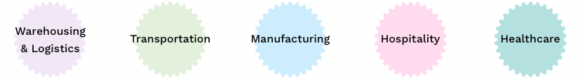
OverviewSpotwork is a start-up company that connects people to flexible and temporary jobs in their area.
They offer positions in industries such as:
The ProblemSpotwork only offers positions in Canada and 1099 jobs.
Being a small startup and only based in Canada, they lacked information about the 1099 and W-2 employment processes in the states. Our team was asked to research popular gig apps, design an onboarding process for W-2 and 1099 workers that includes an educational aspect (1099 vs W-2) because they want to expand to America + add W-2 jobs.
The solutionDesign an onboarding flow for both 1099 and W-2 workers that allows users to:
Read and learn what 1099 and W-2 jobs are and what that entails
➔ add relevant, educational courses
See how far they are in the process
➔ add progress percentage
Save documents and information to come back to later
➔ add pause button

bonusA common pain point we noticed with most of the gig apps was their customer support. Spotwork did not have a chatbot for fast replies on their app, just an email to reach them during business hours.
➔ redesign their contact option to giving users an option to either email or use the chatbot
competitive analysisWe looked into 10+ gig apps..
While analyzing gig apps and reading the reviews of each on Apple Store, we found many of the same issues for most apps. To dig deeper, we narrowed our competitor list to four top gig apps.

Each apps weaknesses:
To summarize this table, the common pain points founded were:
Hard to know how much longer the onboarding process is left to finish
Sign up is not smooth and/or takes a long time
Not enough jobs open in an area
Not enough variety
Only available in some cities
Last minute cancellation from employers
Wrong clock ins cause wrong payments
Poor customer support - slow or no responses
Software glitches
user flowSpotwork was unsure which route to take to step in to the U.S. with.
After giving our competitor analysis presentation, Spotwork expressed they were not sure if they should shift to only W-2 jobs, or give users the option to onboard both 1099 and W-2. To help them make their decision, we created two user flows for a first time user onboarding.
After presenting this, they decided to include 1099 and W-2 jobs on Spotwork.
5 day sprintOur last week with Spotwork called for a five day sprint.
Most of our time with Spotwork was spent researching what entails 1099 and W-2 jobs in the US and analyzing competitors. Once presenting all of our information and deciding how to go about introducing Spotwork in the United States, we had one week left to finish with visuals. To finish this project, a team member organized a design sprint for our last week:
day 1: ideateUsing competitors UI as inspiration, we used the crazy 8s method: eight ideas in eight minutes. This exercise is commonly used in design sprints to help to come up with ideas quickly and hopefully potential screens.

Day 2: Sketch To refine the quick sketches above, these were created for a more detailed version close to what we would like the final product to look like. Sections of the app we focused on includes: education, my jobs + my messages and job search
Education
On the ‘Learn’ page, we added sections to learn about what a 1099 worker and W-2 employee is, as well as how to use Spotwork.
Spotwork asked us to focus on the educational aspect of their app as they want their users to be knowledgeable of what position they’re onboarding for and what that encompasses (documents, benefits, etc.).
My Jobs + Messages
Here we have created separate tabs for 1099 jobs and W-2 jobs. Both tabs include the sections for jobs applied to, waitlisted, offered, hired and past gigs.
This is to help organize each listing accordingly.
Job Search
On the ‘Search’ page, we have jobs posted for users to look at without onboarding. Though to apply for a position, you would have to complete onboarding.
This offers a solution to a huge user pain point: people spending 30+ minutes signing up and onboarding only to find barely to none jobs in their area.
day 3: prototypeWe created the sketches above (plus more) as low-fidelity wireframes, then prototyped them to test for day four. In efforts to showcase a redesign that is suitable for the app, we kept a similar UI to the current design. This will also help Spotwork’s design team to implement our subtle but critical changes.
‘Learn’ page
Educational component
‘My Jobs’ + ‘Messages’ page
1099 and W-2 Jobs separated
‘Search’ page
Able to see jobs before onboarding
W-2 Onboarding
List of steps
List of paperwork
1099 Onboarding
List of steps
Form questions displayed for easier input
Help + Contact Us
Drop drown menu + search bar
Message for help on app
day 4: testEach of us performed moderated in person usability tests with the prototyped screens above with one or two people that met these qualifications:

U.S. Citizen
Familiar with the process of paperwork and applying for a job
We asked each participant to:
① Go through each page in the bottom navigation bar

② Click through the 1099 and W-2 onboarding pages
③ Check out the help and contact button

The results
We combined all of our testing comments and recommendations in a table, listing each from critical to minor issues.
Most issues were UI related like the chat icon not needed on each page, the thin bar was confusing, or unopened messages were not indicated. Other issues were related to the forms during the onboarding process, such as the W-4 form is for employees before starting a job and W-2 form is given at the end of a year from the employer.
day 5: redesignWith the feedback we got, we redesigned a few screens for a better experience.
Before
After
The question mark blended with the background
Chat button on every page was unnecessary
Changed question mark for better contrast
Removed chat button
Before
Users were not sure if the words “1099” and “W-2” were clickable
After
Changed the thin line to a button for a better distinction of which page the user is on
Before
After
These forms should be W-9 and W-2 forms instead
Changed names of forms to correct ones
The bottom half is for employers, not employees
Could either have it greyed out or taken out completely
Before
After
Check out the prototype here!
conclusionWhat I learned and will take forward with me.
I believe we exceeded the expectations and goals of this project 🎉.
We gave research heavy presentations about Gig apps and W-2 vs 1099 workers in the U.S. + a 5 day design sprint that included prototyped flows, usability tests and redesigns. Spotwork was very pleased with our research and designs!
Some key takeaways:
Giving each other our schedules and planning meetings ahead of time. A team member (thanks Moon) sent out a form in the beginning of this project for what hours and days work best for all of us to meet. This allowed us to be able to meet 2-3x a week easily, keeping our communication very strong!
Divide and Conquer. We divided our work between each other, creating an even balance and reasonable amount for each person. This let us meet our deadlines quicker with no extra stress on anyone.
I am grateful for this experience as it is very valuable to my UX/UI journey. Working with other designers, a startup company and learning about the Gig app industry was a fun experience! I shall take what I learned from this adventure and apply it to future projects 🥳