Savr Recipes — Modified 5 Day Sprint by Google Ventures
Startup cooking app to help at home chefs make recipes easily

Project Scope
Redesign and add new features
Duration
5 days (Oct 30 - Nov 3)
Role
UX/UI Designer
Tools
Figma
OverviewSavr Recipes is a mobile app that has hundreds of recipes, cooking tips and also an active community who rate and leave reviews on recipes for other users.
The ProblemUsers experience trouble executing a recipe. 🤬
Recently, there have been negative reviews about recipes having too many steps and advanced techniques. Users have expressed that the instructions are not clear or easy to execute and are disappointed with the outcome.
With this in mind..
How might we make users feel more prepared before starting the recipe and while cooking?
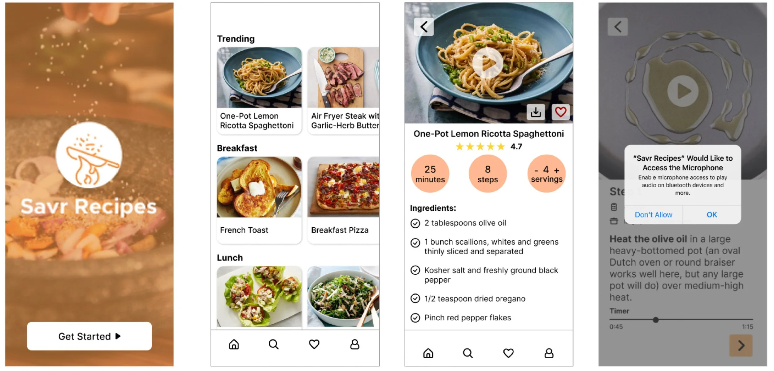
The solutionHelp users accurately, and easily follow the cooking instructions with these features:
Ingredient check list
Voice command for a hands free experience
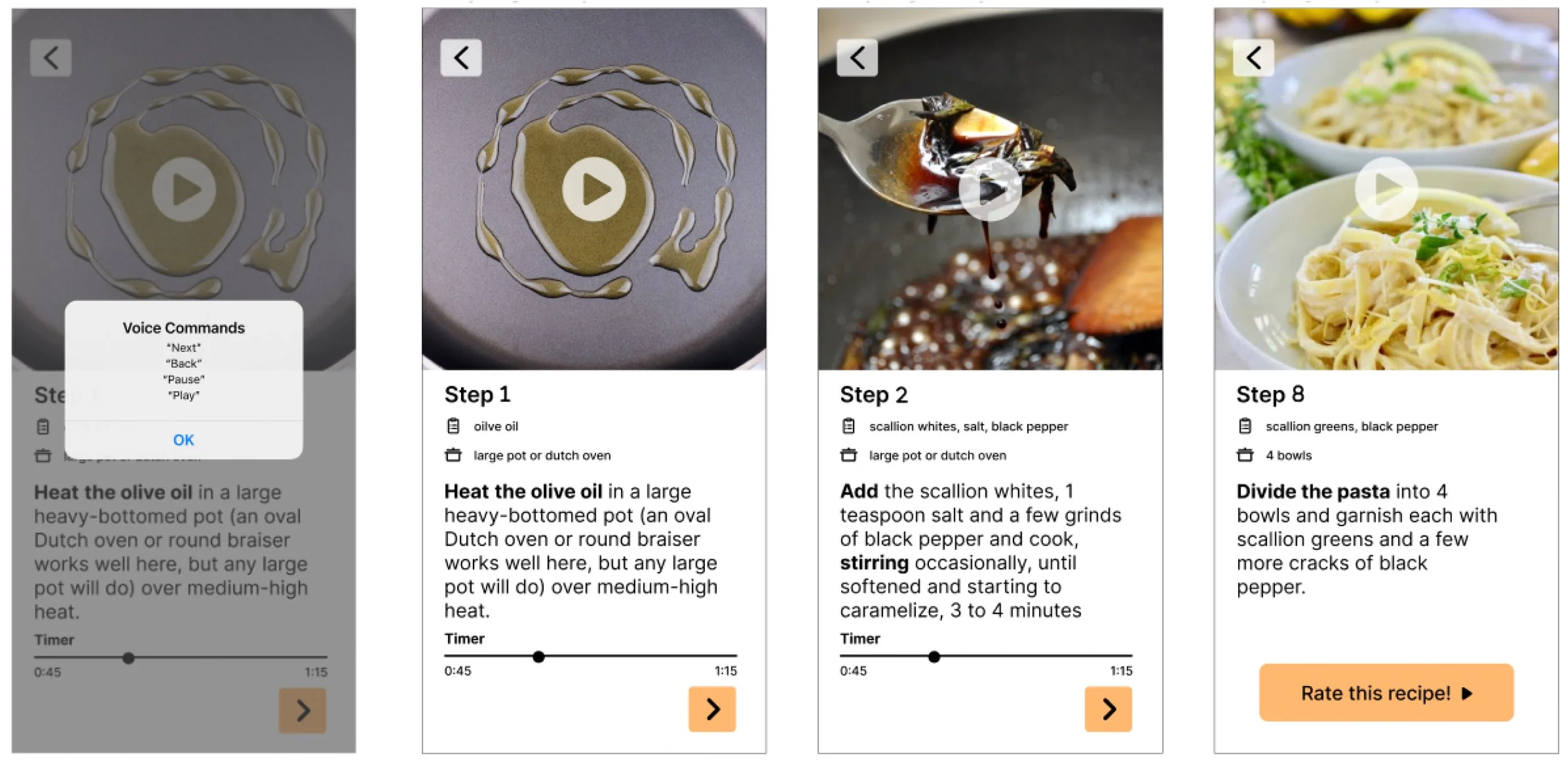
Step by step tutorial with ingredients and kitchenware listed first
Timer
Video tutorial
day 1: understanding and mappingFirst there was some background information given in the brief to review, this includes:
Constraints
Recipes are written out as text, in order from start to finish
Task is to create a feature on Savr Recipes native mobile app
Users like the recipes they find on Savr Recipes, they just tend to have problems executing it

User Persona — Nick, 29 years old
Behavior
‣ Cooks 3x a week usually for himself, sometimes for girlfriend too
‣ Enjoys cooking and trying new recipes
‣ Likes tweaking/improving recipes only after he has cooked it “by the book” once
Frustrations
‣ Sometimes unsure that he’s on the right track
‣ Not always clear on what’s next, leads to mistakes and time wasted
‣ If the dish isn’t as expected, he feels disappointed and not sure what he did wrong
‣ Gets stressed referring to phone often while cooking
Goals
‣ Follow a recipe easily and confidently
‣ Wants trying new recipes to be enjoyable
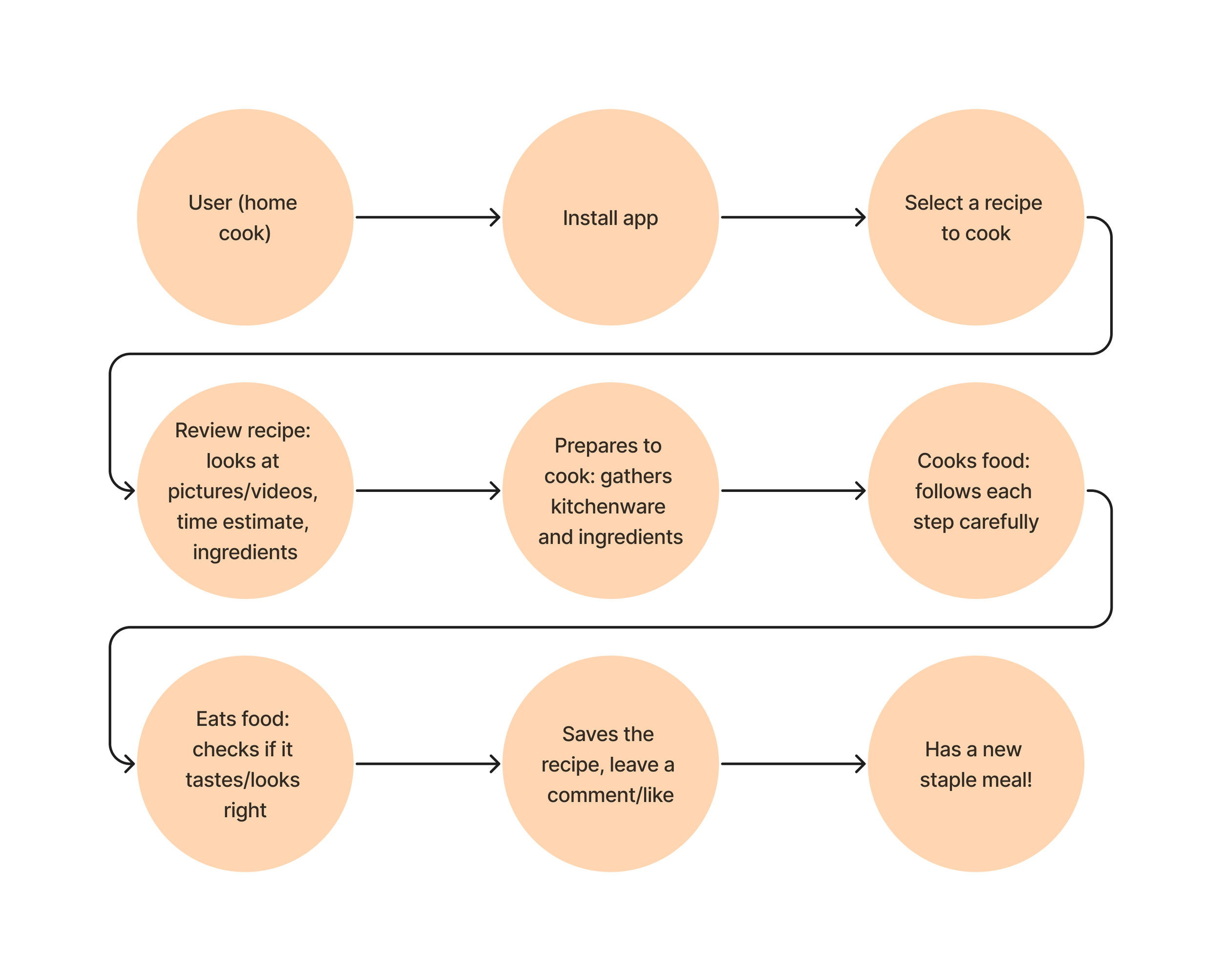
After reading the provided documentation, I created this end-to-end experience map: a likely path a user would take while using an app like Savr Recipes to cook a meal.
day 2: sketchingFirst research then on to the fun stuff.. designing ✏️
Competitive Research: Lightning Demo
With this technique, I look at competitors for inspiration to help come up with solutions.


Food Network
Total time includes chilling and resting
# of ingredients and steps
Special equipment mentioned

Yummy
Lists ingredients with option to add to shopping list


Tasty
includes video tutorial
‘step by step’ mode

Crazy 8’s
During this exercise, I quickly sketched 8 ideas in 8 minutes
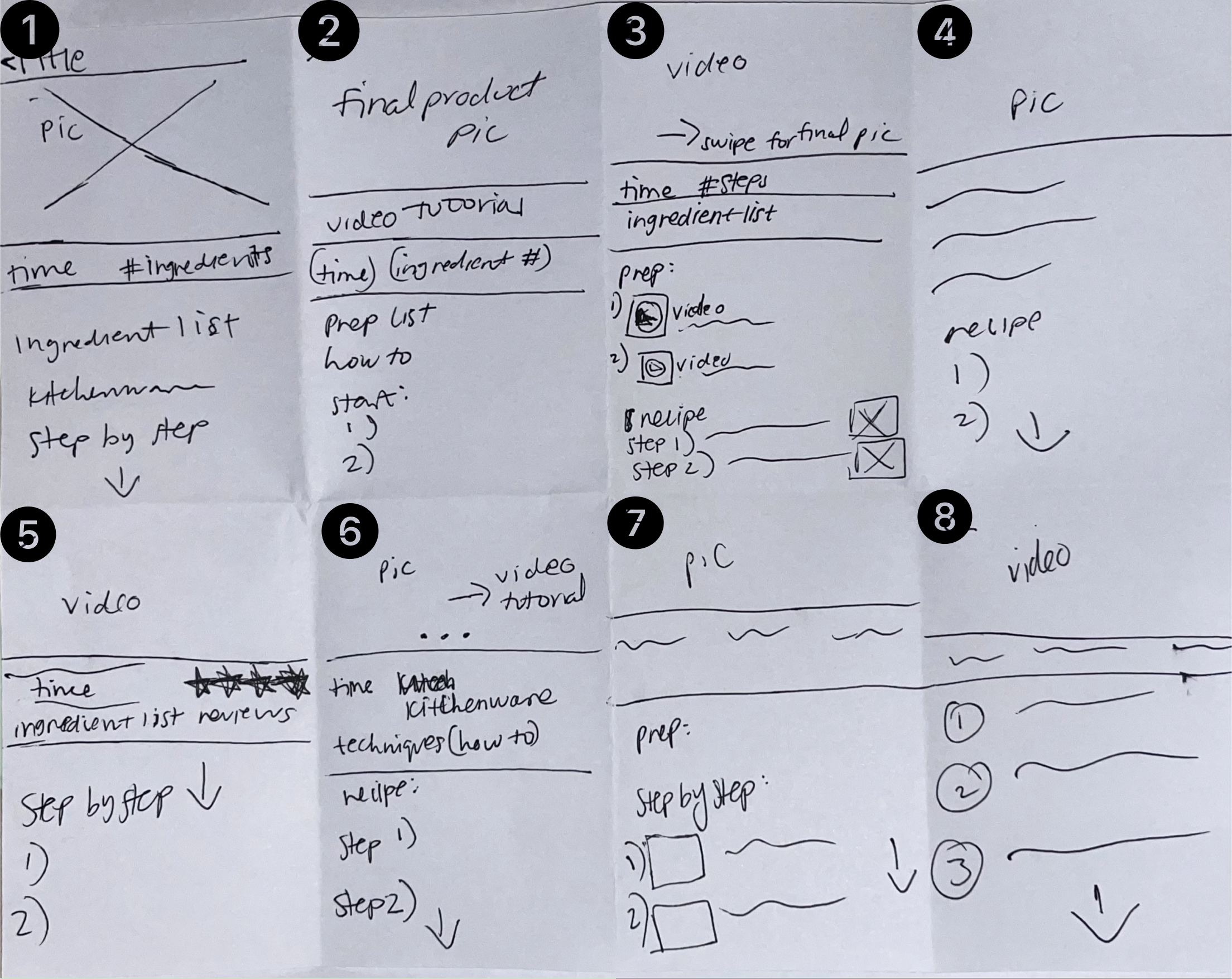
I picked #8 as the solution sketch.
This was closest to what I wanted the final prototype to look like. This idea included the video tutorial, the basic information below it (time, # of ingredients and servings), and the steps listed below.
Then I created a short solution sketch around the critical screen (#8) to help visualize the screens a user would interact with.
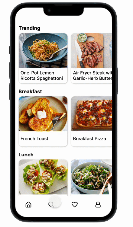
All of the recipes are shown to look through and select.
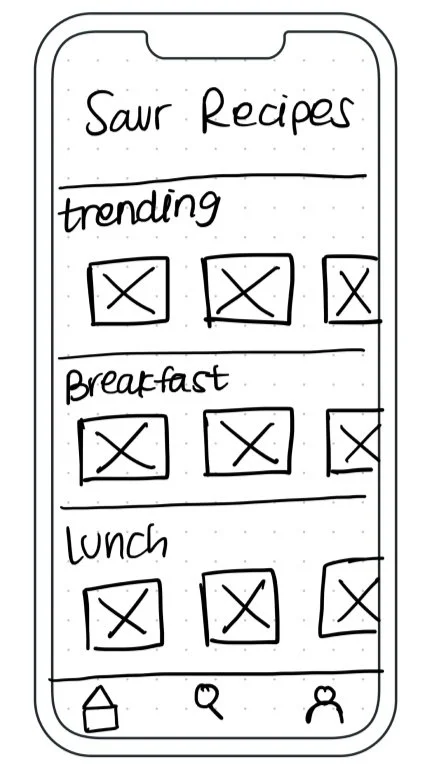
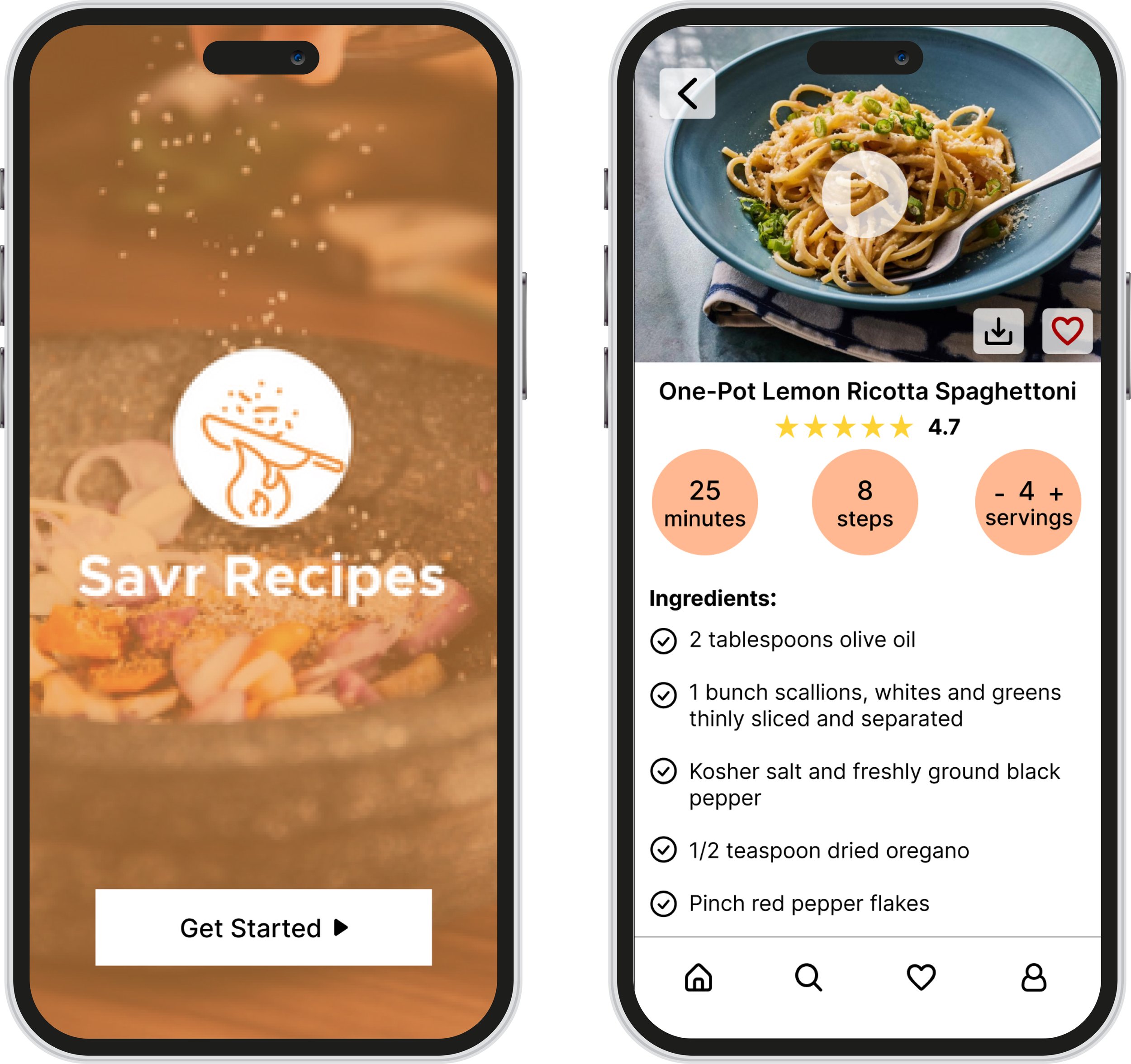
Home Screen
When selecting a recipe, basic information (time, serving size, # of steps and ingredients) is shown at the top, then the ingredient list and kitchenware list.
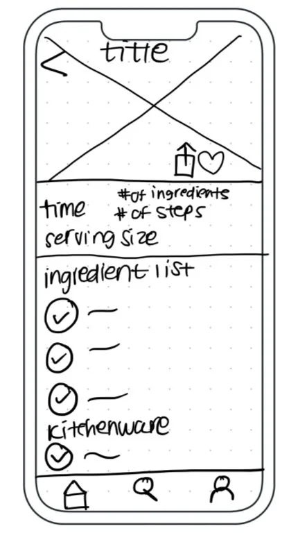
Recipe Screen
Towards the bottom of the page, there are the steps for preparation and directions with a step-by-step option.
Keep Scrolling
day 3: creating a storyboardOnce upon a time.. 📚
Taking the short solution sketches above, I sketched a few more screens to create a storyboard. This allows me to add more details to the original sketch, while creating the foundation of the interface that I will be prototyping.
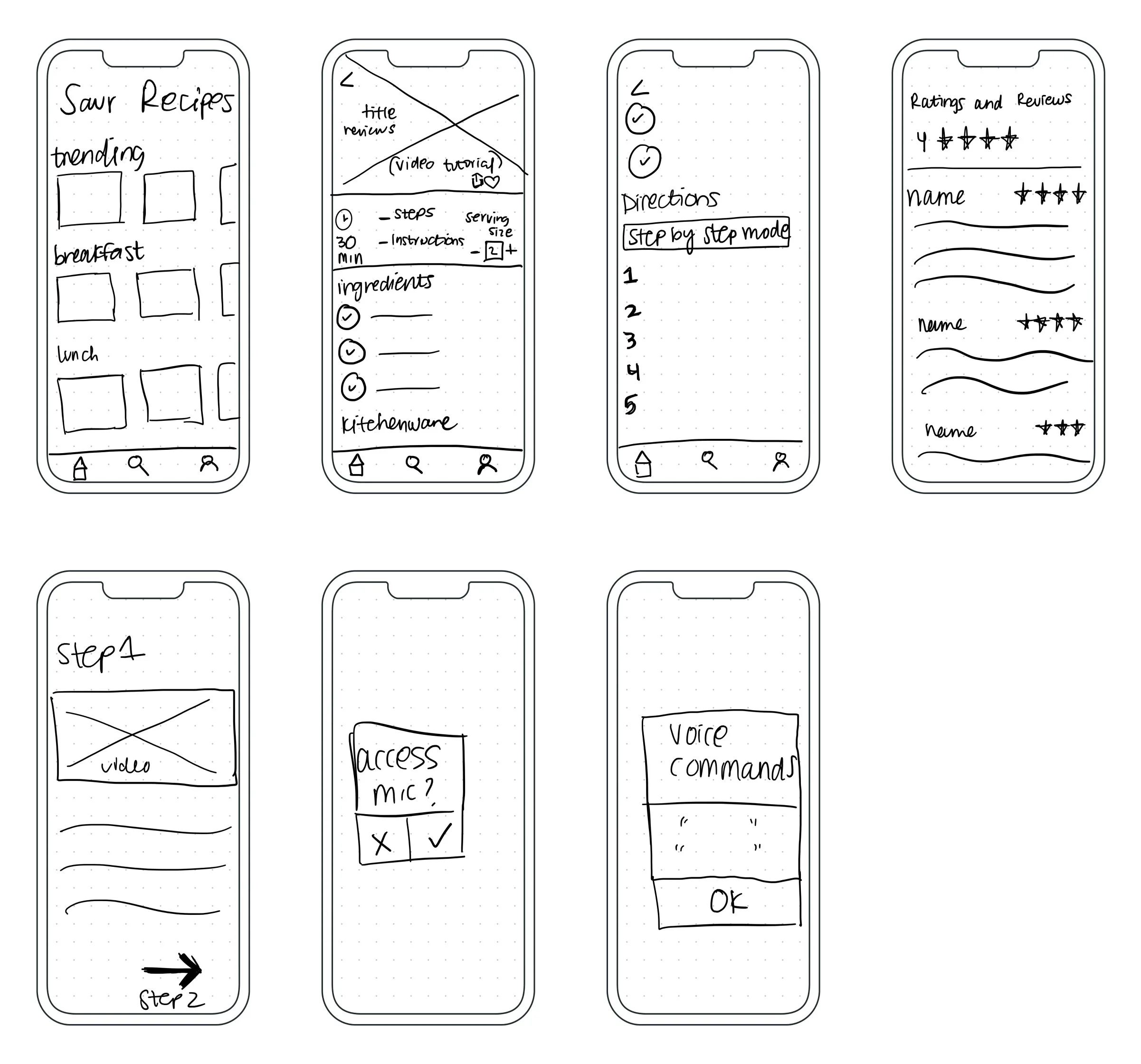
Here a user would:
1) select a recipe 2) review it by scrolling 3) clicking the step-by-step button 4) prompted to allow access to the microphone 5) show the voice commands
day 4: Building a prototypeThe big issue is executing a recipe, not finding it. 😠
Referring back to the negative reviews and the user persona that captures all of the pain points, I designed these high fidelity wireframes with a very simple, yet aesthetic style to be straight forward and easy to use.
day 5: testMission Accomplished 🚀
I conducted 5 moderated usability tests via FaceTime to watch and understand how users interact with my prototype.
I asked each participant to click the first recipe and select the step-by-step mode. From there it was self explanatory on what to click next.
100% of them said:
It was simple and easy to understand and use (no explanation needed)
Liked the step by step mode
Liked the timer
Originally, the mic access and voice command messages came up when you click the recipe on the home page, but 2/5 users suggested the popup screens for the mic and commands to show up when you click the step-by-step mode.
Savr Recipes is expected to have an increase in user engagement due to the additions: a timer and step by step mode. It is also projected to have less negative reviews.
Overall 5/5 users were success going through all screens and back, while also having positive feedback throughout the testing
Feel free to check out the prototype here!
conclusonMore time = more detail 🔎
Although all participants were able to understand the idea and follow through the screens successfully, I would add more detail to help save more time.
Possibly adding the upcoming step on the same page as the current step to help the chef prepare for what is next.
This design sprint helped me gain confidence by allowing me to jot down multiple ideas and working quickly through them. This was a HUGE learning experience in such a short amount of time.