

On Track
Family and friends health tracking app
Project Scope
Create sustained engagement
Duration
1 month (December - January)
Role
UX/UI Designer
Tools
Figma
OverviewOn track is a family and friends health tracking app that allows users to see how people in their group are doing regarding health and fitness.
The ProblemUser engagement drops after a few weeks 📉
User engagement is heavy for the first few weeks then drops significantly followed by deleting the app. On Track shows users their individual goals and are notified when they are accomplished, it does not alert other members. Also there is no messaging feature.
The solutionLet’s talk 🗣️
To increase engagement:
Integrate messaging for users to check up on each other and ask about progress, after all someone is 95% likely to meet a goal when having regular check ins with an accountability partner (the American Society of Training and Development).
Add notifications for friends and family to see when they accomplish goals.
Social media aspect where users are able to post on a feed and able to like and comment under.
Communities/groups page to join and share with others.
researchWhat competition? ⚔️
I analyzed industry leaders to help me gather information on what I feel is lacking, and what I would take as inspiration. This allows to me easily identify strengths and weaknesses that I can incorporate or avoid in my design solutions.


Fitlist
Likes
‘Workouts’ page
Able to send workout summary and post to feed
Dislikes
No chat feature
Have to pay for most features
➞ Action Item: incorporate a browse section


Productive Habit Tracker
Likes
Contemporary Colors
Can share challenges outside of app
Chat for challenges
Dislikes
No private chat feature
➞ Action Item: have a private chat and challenges


Nike Run Club
Likes
Events posted for people to go to
Dislikes
No chat feature
➞ Action Item: have events posted
user interviewsStep into my office 👟
Understanding the choices people make in attempt to be healthier helps me connect the solution I am designing to people’s needs and wants.
The requirements to participate were 1) have fitness/health goals 2) own a smartphone
I conducted five user interviews with these questions in mind:
What steps do most people take when they want to achieve a fitness/health goal?
Do people prefer someone to keep them accountable? A close friend/family or stranger?
How often do people reach their fitness goals?
(There is more information in my Research Plan like background, objective, methodologies, participants, and schedule)
Interview results 📨
5/5 Interviewees:
Use the Apple Fitness app that’s linked to their watch
Prefer to have an accountability partner because it is motivating
3/5 Interviewees:
Use MyFitnessPal to count calories and for meal ideas.
Key Takeaways:
Users are more engaged in activity when there is accountability
Users are not likely to pay for an app for all or most of it’s features

To condense all the information I gathered from interviews, I created a user persona that presents the type of person that would use a health/fitness app and an empathy map to showcase the results from my interviews as well as understand what my target audience’s behaviors are.
user persona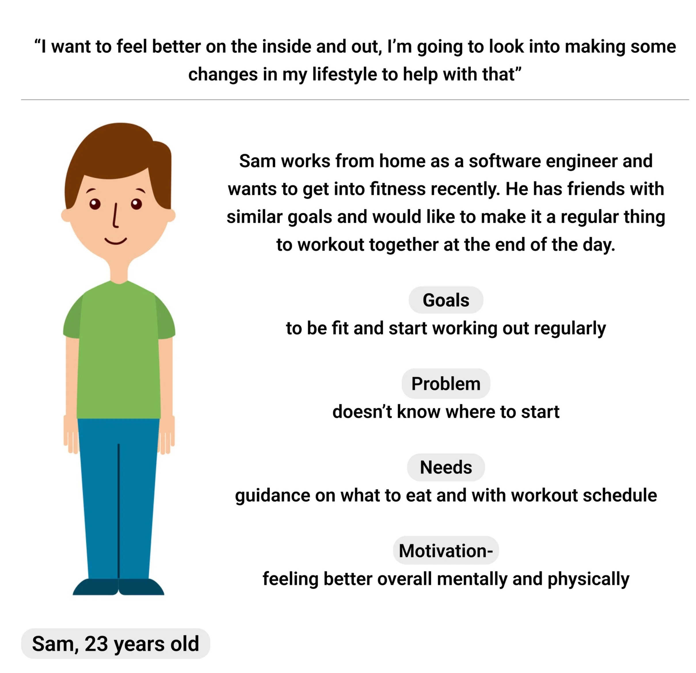
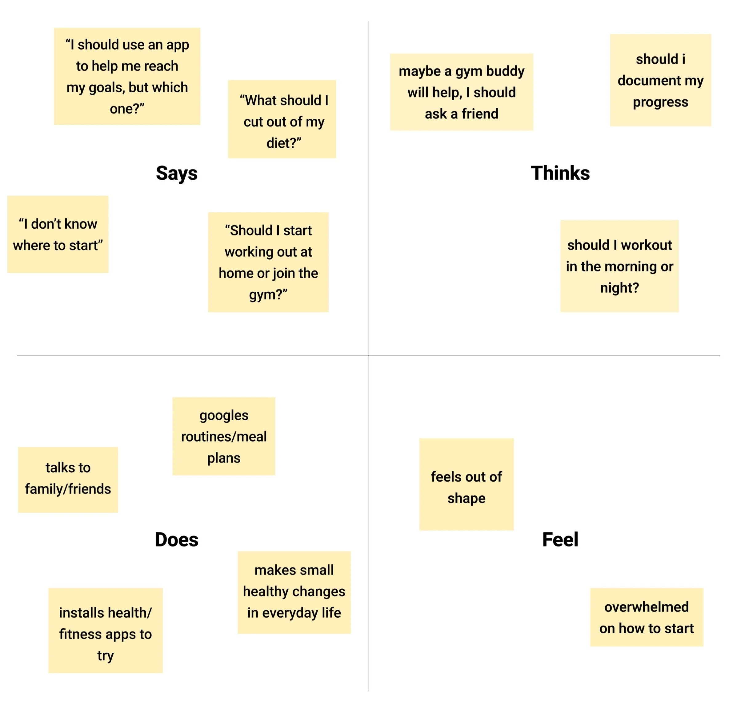
empathy mapdesignUser flows 🧬
Once I understood my user needs and behaviors, I created two user flows to help visualize the steps a user would take. These flows are to create sustained engagement, by being able to send invitations easily and share progress, these are more of a reason to stay on the app and use it.

Flow #1: Sending invitations to friends or family

Flow #2: Sharing progress with friends or family

Legend
Low fidelity wireframesHere are two versions of low-fidelity wireframes I created of each screen in the bottom navigation bar.


Changes made:
Home Screen: added logo and name
Club Page: adjusted the size of boxes, removed app name on top and moved search bar
Chat Page: added a sharing tab and moved adding a friend/family member on that page where you can send a link
Profile Page: more detailed schedule and badge message, adjusted words and profile picture circle size

testing low fidelity wireframesMain comments and concerns 💬
I conducted five remote moderated usability tests and these are the common points:
5/5 Interviewees:
Appreciated the private chat aspect of a fitness/health app
Questioned the checkered layout in the profile page
Were successful at going through pages in the navigation bar, as well as observing each
Liked the idea of a dark theme (reminded them of the Apple Fitness app)
Were confused about the friends and sharing tab (not clear enough)
Most likely turn their notifications off, would rather see progress of others on the app
2/5 Interviewees mentioned that trainers available on the app would be helpful.
high fidelity wireframesChange of plans 📋
Taking the comments, concerns and suggestions from the usability testing, I decided to change the layout quite a bit, as well as some features.


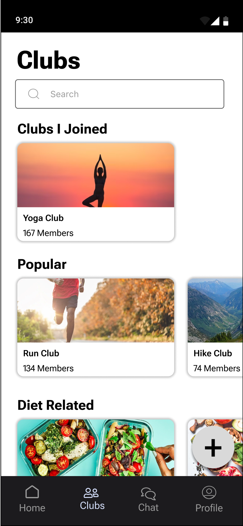
To address some of the confusion from testing —
Instead of the friends/sharing tab, I created a top 3 leaderboard on the home screen. This also takes place of constant notifications when others achieve a goal. Now users are able to see who their competition is and use this as motivation! Additionally, I found a different way to present progress in the profile page. This visual suited the look of OnTrack and was easy to read and understand.
testing high fidelity wireframesAlmost there 🏃♀️
For this round of remote moderated usability testing, I asked five different people to try my prototype.
I asked each to:
Add a post, specifically my stats, on the feed
Check out Clubs I Joined
Observe Chat page
Invite friends and family on profile page
Although majority of the feedback was positive, participants were confused about the plus button on the clubs page.
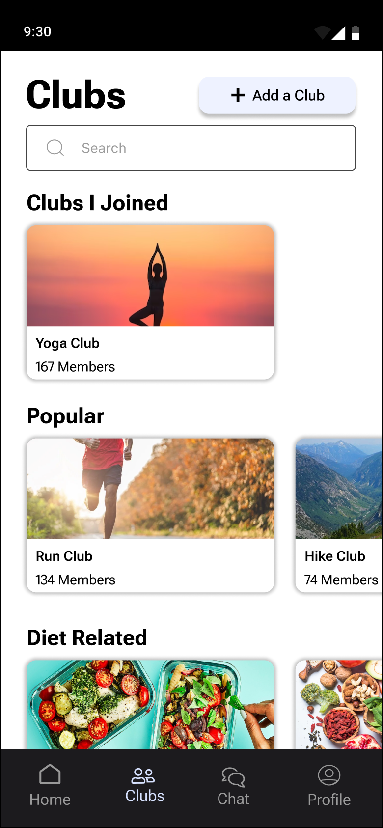


I added a similar button to “Add a Post” for this as it is much clearer. When selected, a tab pops up where you can add the details to your new club.
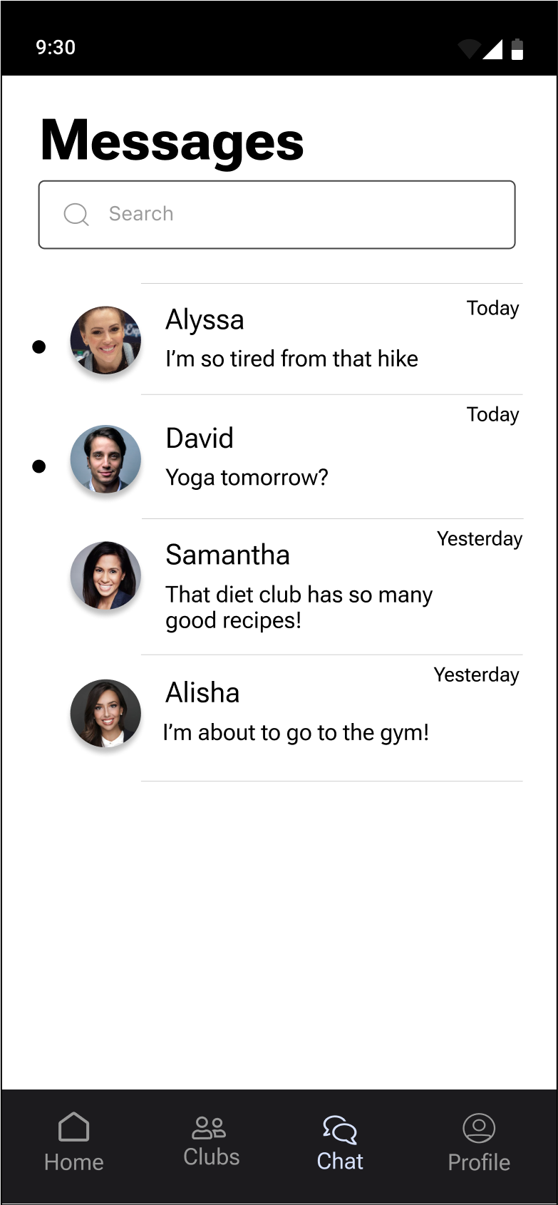
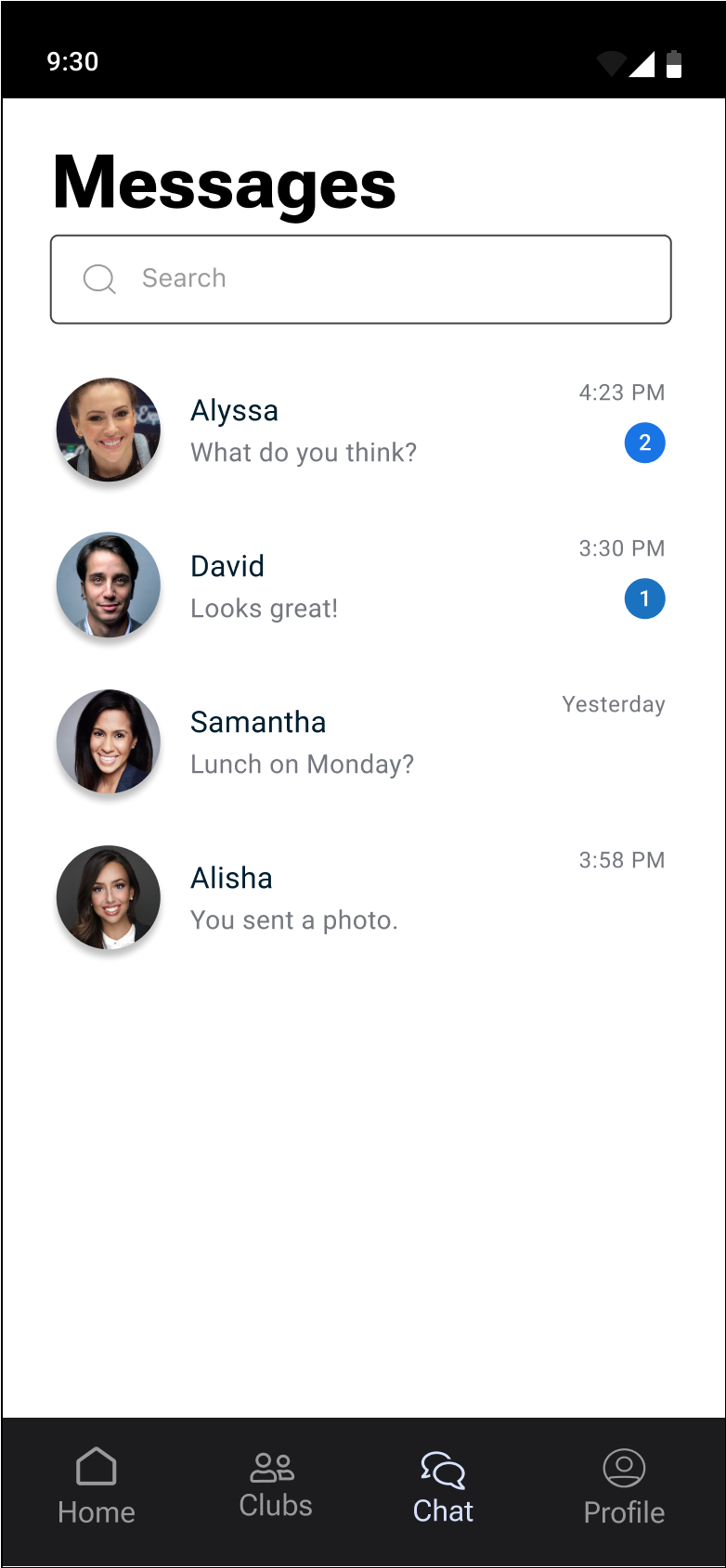

And for more of an android feel, I changed the messages page to look more fitting.
Check out the prototype here!
conclusionLess is more 🔑
My main focus for this project was to hit all of the solution points I listed earlier. While reaching this goal, I wanted to design OnTrack as minimal as possible while including everything important.
This challenge allowed me to step out of my comfort zone and put a test to my UX/UI skills. I stuck to what is important to the target users and my overall feedback goes to show that!
